Welcome to the Journalism Portfolio of Hope Johnson.
Design
As design is my favorite aspect of journalism, I cannot have a portfolio without showcasing the yearbook theme package I created for my school's 2014-15 yearbook. I was appointed editor-in-chief of our book, the Drift, my junior year, and began designing right away. I wrote the copy, designed the templates, created the graphics, and edited all the pages. In addition, I created the center spread for each monthly issue of my school newspaper, the Zephyr. I have showcased several of both below.
2015Yearbook
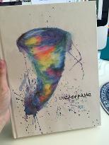
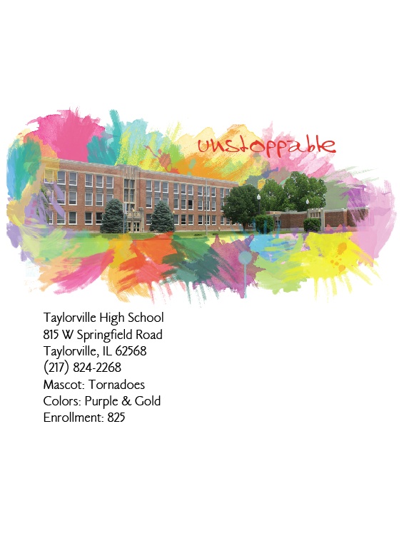
The 2014-15 yearbook theme was "Unstoppable." I loved how I could tie the theme in with the school mascot, the Tornado. I loved the bright colors and excitement in this book. I wanted to have lots of white space that made the colors pop! Our art teacher actually made the cover with water color, so that gave a unique, personal touch to our book. I discovered how to make cut-outs on Photoshop right before doing this theme, so I included a lot of cut-outs with paint splashes behind!
Front Endsheet
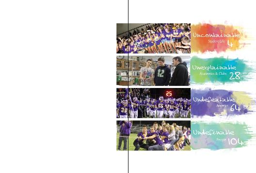
I wanted the sections of my book to have spinoff names from the theme "Unstoppable." I named the people section "Uncontainable," academics "Unexplainable," sports "Undefeatable," and people "Undefinable."
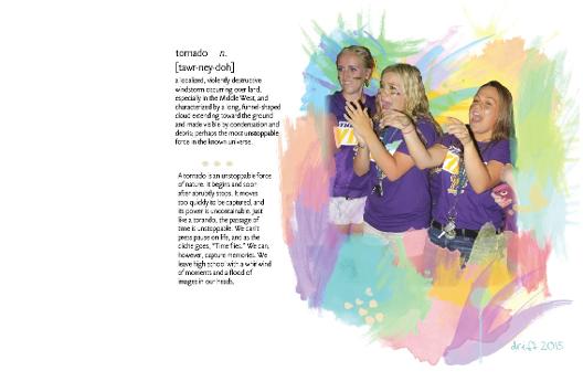
Opening
"tornado n.[tawr-ney-doh] a localized, violently destructive windstorm occurring over land, especially in the Middle West, and characterized by a long, funnel-shaped cloud extending toward the ground and made visible by condensation and debris; perhaps the most unstoppable force in the known universe.
A tornado is an unstoppable force of nature. It begins and soon after abrubtly stops. It moves too quickly to be captured, and its power is uncontainable. Just like a torando, the passage of time is unstoppable. We can’t press pause on life, and as the cliche goes, “Time flies.” We can, however, capture memories. We leave high school with a whirlwind of moments and a flood of images in our heads.."
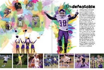
Sports Section Divider
I wanted my dividers to be full of energy and color. I thought including some photoshop skills along with just several normal picture boxes would give a unique feel. Most dividers I had seen use one or the other; I thought - why not both? I also wanted to use parallelism in the copy to add emphasis and a bit more spark.
"Screaming until our voices escaped us as the football team won the conference championship after the game against Mattoon. Shivering in hats and gloves in freezing weather to witness an important game. Cheering our hearts out for the volleyball team in Pana, decked out in our Tornado gear. Practicing every day over Christmas vacations and days off. Working relentlessly, despite the aches and pains. Playing our hearts out on the field, court and track. Celebrating our athletes advancing to the state competitions and bidding them the best of luck. Traveling to watch our friends compete, even with the longer drives that accompanied the change of conferences. Singing on bus rides, encouraging each other and enjoying every second. Fighting and never quitting; learning from both wins and losses. Working the Tornado way: 100% effort, 100% of the time. Coming together as a community to support our athletes. Making the year unforgettable for THS sports. Our passion made us undefeatable."
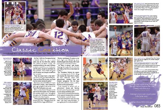
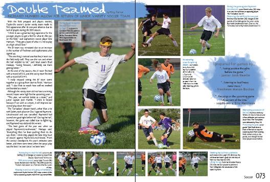
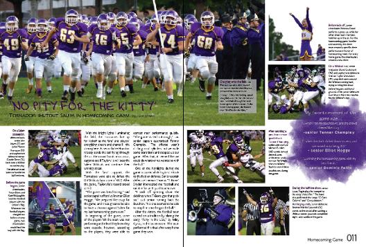
Sports Page Samples
To carry the theme throughout the book, we used two swatches of paint on each page: one behind the white headline, and another for a sidebar question. We wanted to utilize the white space to make the colors and pictures pop.
Every once in a while, to switch up the look, we would remove the paint swatch behind the headline and simply place the headline on the dominant photo to add variety.
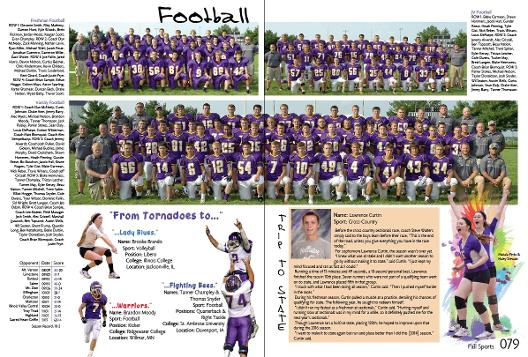
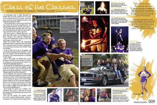
An example of a fall sports team photo page. In the back of the fall, winter, and spring sports spreads, we include a section with all the team photos. This spread has the freshman, JV, and varsity football teams, along with several sidebars. I decided to do a "From Tornadoes to.... ??" piece (bottom left) where I made cutouts and highlighted each of the players continuing their sports on the college level. There were several more in the winter and spring sections. Also, I included a "Trip to State" segment on cross-country runner Lawrence Curtin. This sidebar also worked out perfectly because we had one wrestler from winter sports make it to state and one girl track runner from spring sports.
Student Life Divider
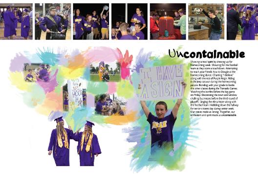
"Spending the rain delay during the first home football game dancing in the cafeteria. Chanting and swaying back and forth before the “storm chase.” Helping with community service activities. Shopping at Walmart for the Angel Tree. Singing our hearts out at the music festival. Seeing friends in the hallways. Growing closer to friends and making new ones. Laughing at lunch tables. Making memories. Discovering who we are, expanding views, listening to others. Giving blood, participating in tournaments. Living our lives to the fullest. Our unique personalities made us undefinable."
Student Life Page Samples
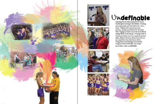
People Section Divider
I love how I switched the divider templates up! I didn't want to have boxes going across the bottom every time. I wanted to change the look. Also, I loved finding the photos that I used as what I called "the explosion picture," or the picture that the huge splash of color and other pictures originates from. I chose cheerleaders throwing up pom-poms, two best friends high-fiving at graduation, a cross-country freshman handing her senior sister a basket of gifts on senior night, and a student playing a trombone. I felt these photos were exploding with passion and emotion. It felt fitting to have the color exploding from them.
"Spending the rain delay during the first home football game dancing in the cafeteria. Chanting and swaying back and forth before the “storm chase.” Helping with community service activities. Shopping at Walmart for the Angel Tree. Singing our hearts out at the music festival. Seeing friends in the hallways. Growing closer to friends and making new ones. Laughing at lunch tables. Making memories. Discovering who we are, expanding views, listening to others. Giving blood, participating in tournaments. Living our lives to the fullest. Our unique personalities made us undefinable."
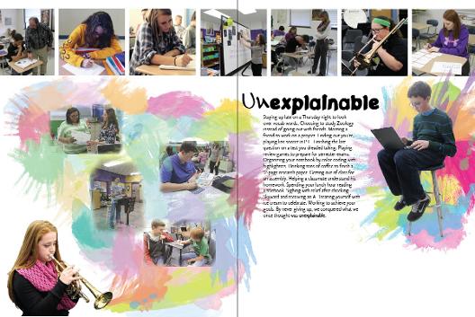
Academic Spread Divider
"Staying up late on a Thursday night to look over vocab words. Choosing to study Zoology instead of going out with friends. Meeting a friend to work on a project. Finding out you’re playing line soccer in P.E. Finishing the last question on a test you dreaded taking. Playing review games to prepare for semester exams. Organizing your notebook by color coding with highlighters. Drinking tons of coffee to finish a 12-page research paper. Getting out of class for an assembly. Helping a classmate understand his homework. Spending your lunch hour reading a textbook. Sighing with relief after checking Skyward and receiving an A. Treating yourself with ice cream to celebrate. Working to achieve your goals. By never giving up, we conquered what we once thought was unexplainable."
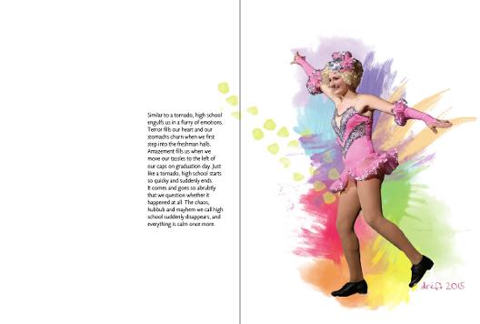
Closing
I knew when I saw this picture it would be on my closing spread. Her pose screams "ta-dah," and I could imagine the colors bursting from her.
"Similar to a tornado, high school engulfs us in a flurry of emotions. Terror fills our heart and our stomachs churn when we first step into the freshman halls. Amazement fills us when we move our tassles to the left of our caps on graduation day. Just like a tornado, high school starts so quicky and suddenly ends. It comes and goes so abrubtly that we question whether it happened at all. The chaos, hubbub and mayhem we call high school suddenly disappears, and everything is calm once more."
2016 Yearbook
Though work on the 2016 yearbook is still underway, we have already designed the cover and chosen the theme. Below is the cover of the upcoming THS yearbook, along with the inspiration behind the theme.
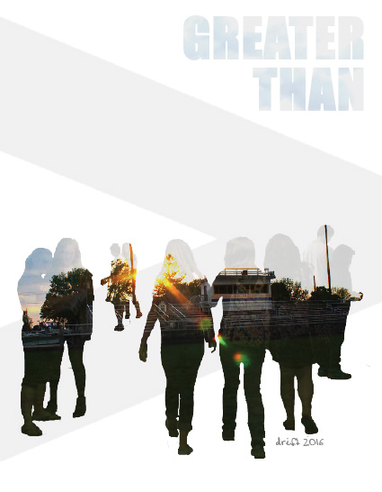
The theme of this year's book is "Greater Than." We are using the quote, "The whole is greater than the sum of its parts."
We feel it relates to high school in many ways. The whole high school experience is greater than the individual memories. The whole team is greater than the individual players. The knowledge gained in a class is more important than the individual lessons.
We are using the double exposure photoshop effect shown here throughout the whole book. We love the pictures inside of pictures and think the effect goes well with the quote and theme.
Newspaper
Since a newspaper center spread follows several of the same guidelines as yearbook spreads, I designed the school newspaper center spread every month as well. I loved it because it gave me practice designing other things than just yearbook spreads, and allowed me to create designs differing from the theme of the yearbook.
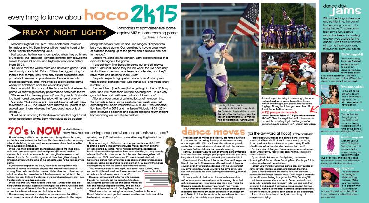
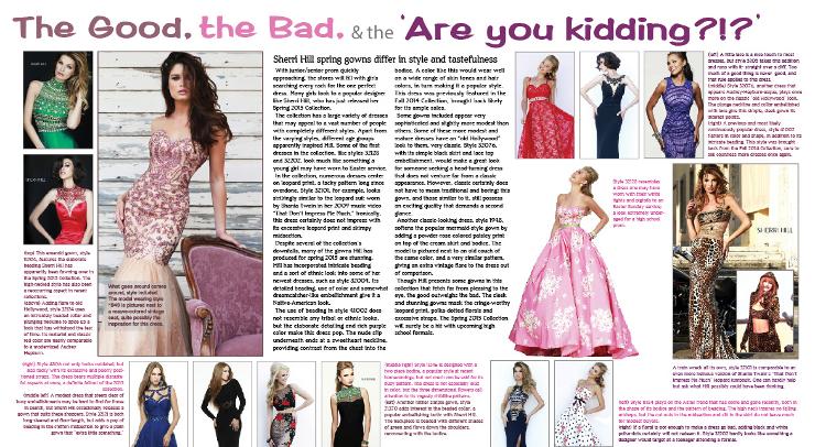
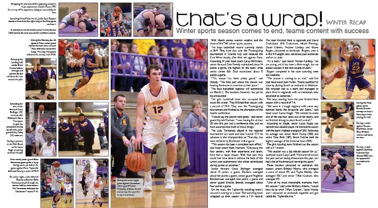
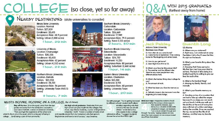
Published in the Zephyr Newspaper (8/15)
Published in the Zephyr Newspaper (2/16)
Published in the Zephyr Newspaper (12/15)
Published in the Zephyr Newspaper (12/16)